Fender Play Refresh — combining the digital and physical world
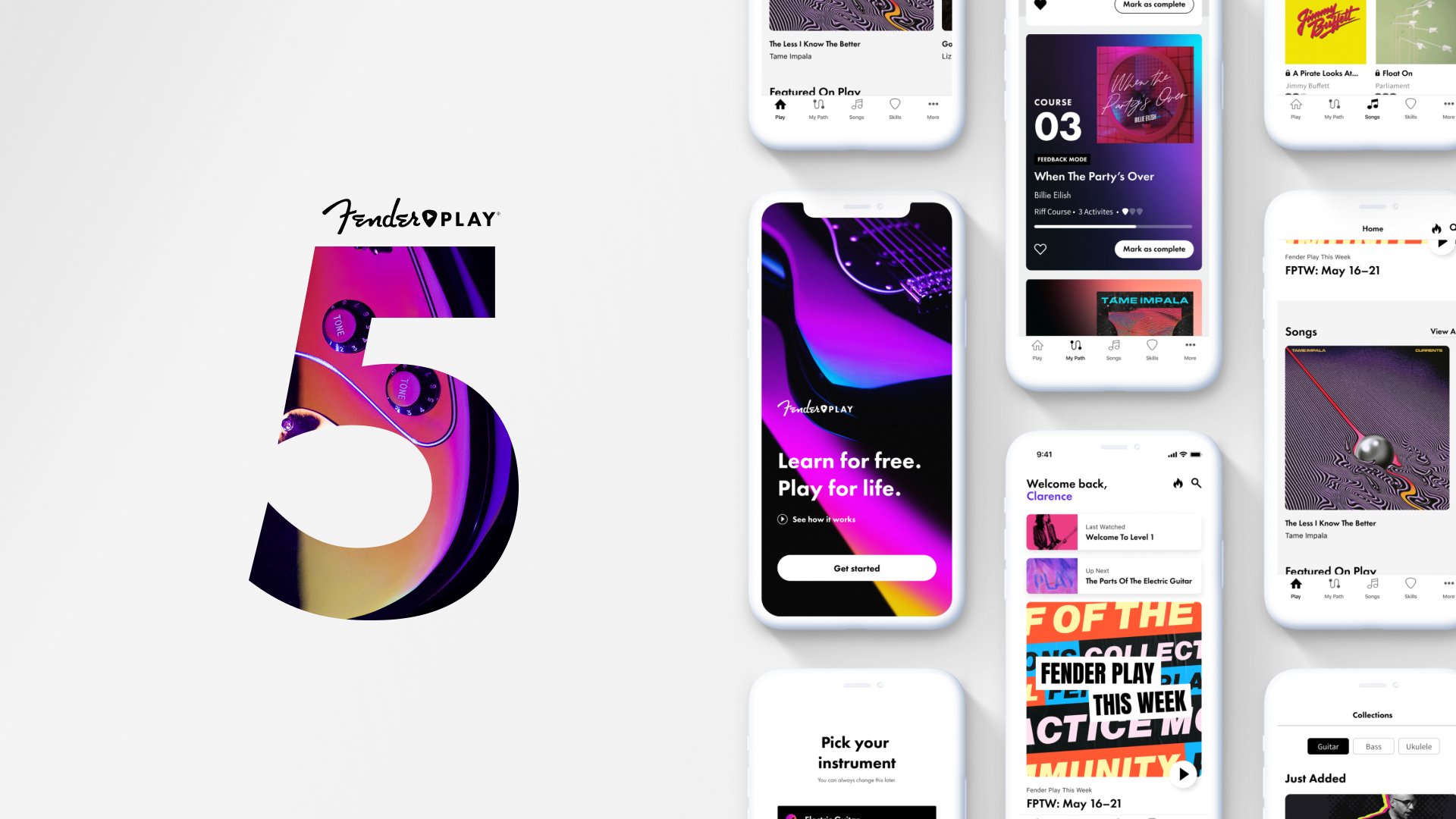
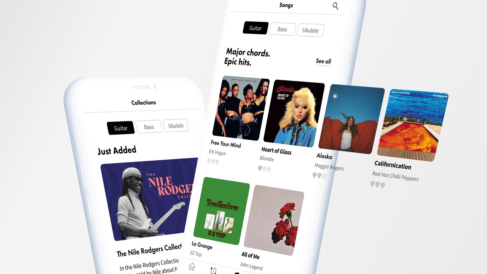
Fender Play 5 is the new and improved version of Fender's online learning platform that's perfect for beginners who want to learn how to play the guitar. We launched it simultaneously with the California Player Series, Fender's first-ever marketing campaign aimed at new players.
The new and updated user interface of Play 5 sets the foundation for future iterations of Fender's learning experience, paving the way for a more immersive and engaging platform that meets the needs of guitarists at every skill level. This project is a testament to Fender's ongoing commitment to creating exceptional learning experiences for guitar enthusiasts and is an essential component of Fender's growth strategy.
WHAT
UI/UX Design
Art Direction
Brand Creation
Concepting
User testing
Design System
Prototyping
PLATFORM
Web
iOS
Android
TIME
3 months
2021

The Design Approach
The design approach for Play 5 was simple. Design for Evolution. The Play experience, and brand, will grow and evolve significantly throughout the decade. We will test, learn, and challenge our assumptions about what makes a Fender learning experience. A scalable design architecture is the first step towards a world-class digital brand experience.


COLOR
We used color to bring life and vibrancy to our UI, and it is one of the hardest working components in our entire design language. The focused application of color helps us to prioritize information and action. Our Play extended color profile accommodates multi-state components, contextual messaging, and alerts. Color helps us create unity between utility and emotion.

GRADIENTS
Gradients give us the flexibility to create compositions around interactive content that is constantly evolving. Our gradients all include black, which gives us the ability to dial up the contrast ratios depending on the components in front of the gradient.
We primarily use gradients to accompany songs on a user's path. This celebrates and features our song-based lessons. Outside of songs, we should use gradients sparingly. Our gradients compliment and support our imagery.


IMAGERY
Imagery is the fabric that makes up the tapestry that is Play’s visual experience. The Play user interface helps the users navigate through a valuable and fun visual narrative made possible by the images and content in Play.